By Group "DeepDiver"
1. Comparison of the Number of Comments Based on Product and Platform levels
Before visualizing, we should load the data and get the useful data we need for graph.
Dict = {'Amazon_Colgate': pd.read_csv("amazon_colgate.csv"),
             'Amazon_Oralb': pd.read_csv("amazon_oralb.csv"),
             'Amazon_Philiip': pd.read_csv("amazon_philiip.csv"),
             'Bestbuy_Colgate': pd.read_csv("bestbuy_colgate.csv"),
             'Bestbuy_Oralb': pd.read_csv("bestbuy_oralb.csv"),
             'Bestbuy_Philiip': pd.read_csv("bestbuy_philiip.csv"),
             'Target_Colgate': pd.read_csv("target_colgate.csv"),
             'Target_Oralb': pd.read_csv("target_oralb.csv"),
             'Target_Philiip': pd.read_csv("target_philiip.csv")}

products = ['Oralb', 'Philiip','Colgate']
platforms = ['Amazon',  'Target','Bestbuy']

Product = {}

def dic(product):
    num = {}
    for platform in platforms:
        name = platform + '_' + product
        num[platform] = Dict[name].shape[0]
    Product[product] = num

for product in products:
    dic(product)

df = pd.DataFrame(Product)
labels = products

x = np.arange(len(labels))
width = 0.25

p1 = plt.bar(x - width, df.iloc[0], width, label='Amazon',color = '#4682B4')
p2 = plt.bar(x , df.iloc[1], width, label='Target', color = '#00BFFF')
p3 = plt.bar(x + width, df.iloc[2], width, label='Bestbuy',color = '#87CEFA')

plt.xticks(x, labels=labels)
plt.legend()
plt.bar_label(p1, label_type='center')
plt.bar_label(p2, label_type='center')
plt.bar_label(p3, label_type='center')
plt.ylabel('Sum of Reviews')
plt.title('Comparison of the Number of Comments Based on Product level')
plt.figure(figsize=(8,4.5),dpi=150)
plt.savefig('1.jpg')
plt.show()
By changing some keywords and parameters, we can get another graph showing the comparison of the number of comments based on platform level
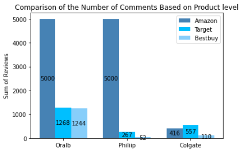
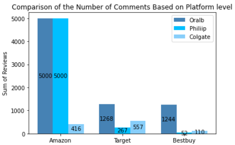
From the two pictures, we can know that we obtained 13,914 pieces of raw data in total, which were distributed by different shopping platforms or brands as follows. It could be inferred that customers on different platforms had different brand preferences. Oral-B and Philips were very popular on Amazon, but customers from Target.com preferred to buy Colgate's electric toothbrush.
2.Visualize the Distribution of Rating Levels
In this part, we got some problems when we used the code below to draw the bar chart.
for product in products:
name = platform + '_' + product
total_row_cnt = Dict[name].shape[0]
rating_1_cnt = round(Dict[name][Dict[name].rating == 1].shape[0]/total_row_cnt*100,2)
r1.append(rating_1_cnt)
rating_2_cnt = round(Dict[name][Dict[name].rating == 2].shape[0]/total_row_cnt*100,2)
r2.append(rating_2_cnt)
rating_3_cnt = round(Dict[name][Dict[name].rating == 3].shape[0]/total_row_cnt*100,2)
r3.append(rating_3_cnt)
rating_4_cnt = round(Dict[name][Dict[name].rating == 4].shape[0]/total_row_cnt*100,2)
r4.append(rating_4_cnt)
rating_5_cnt = round(Dict[name][Dict[name].rating == 5].shape[0]/total_row_cnt*100,2)
r5.append(rating_5_cnt)
plt.figure(figsize=(9,6))
xlabels = products
width = 0.8
p1 = plt.bar(xlabels ,r1, width, label='rating_1',color = '#00FA9A')
p2 = plt.bar(xlabels , r2, width, bottom=r1, label='rating_2', color = '#66CDAA')
p3 = plt.bar(xlabels, r3, width,bottom=r1 + r2, label='rating_3',color = '#7FFFD4')
p4 = plt.bar(xlabels, r4, width, bottom=r1 + r2 + r3, label='rating_4',color = '#40E0D0')
p5 = plt.bar(xlabels, r5, width,bottom=r1+r2+r3+r4, label='rating_5',color = '#20B2AA')
plt.bar_label(p1, label_type='center')
plt.bar_label(p2, label_type='center')
plt.bar_label(p3, label_type='center')
plt.bar_label(p4, label_type='center')
plt.bar_label(p5, label_type='center')
plt.ylabel('percentage(%)')
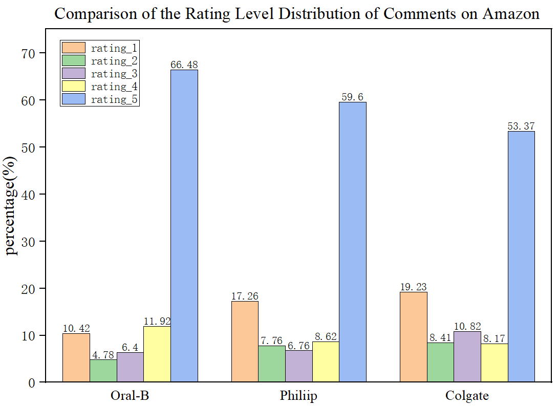
plt.title('Comparison of the Rating Level Distribution of Comments on Amazon')
plt.show()
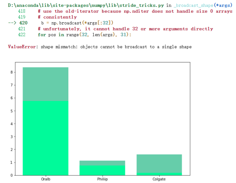
Finnaly, we solved the problem following the instructions from the link of github.
GitHub - matplotlib/cheatsheets: Official Matplotlib cheat sheets
A very useful link to plot in python (Strongly Recommend!!!)
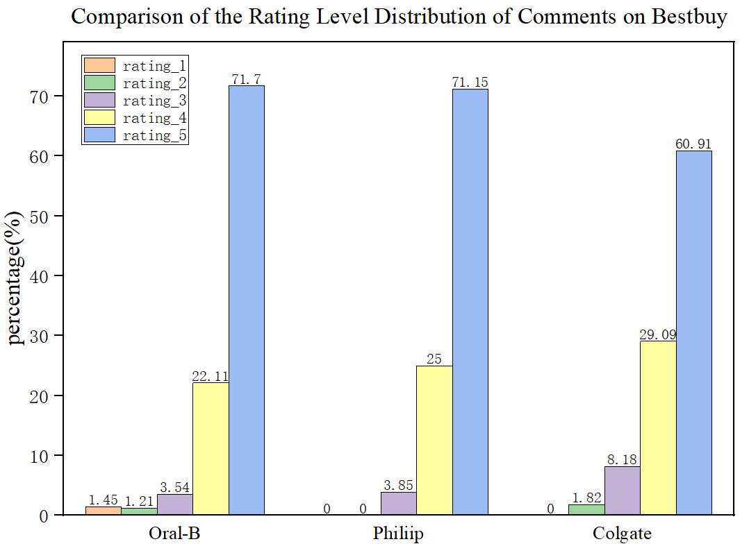
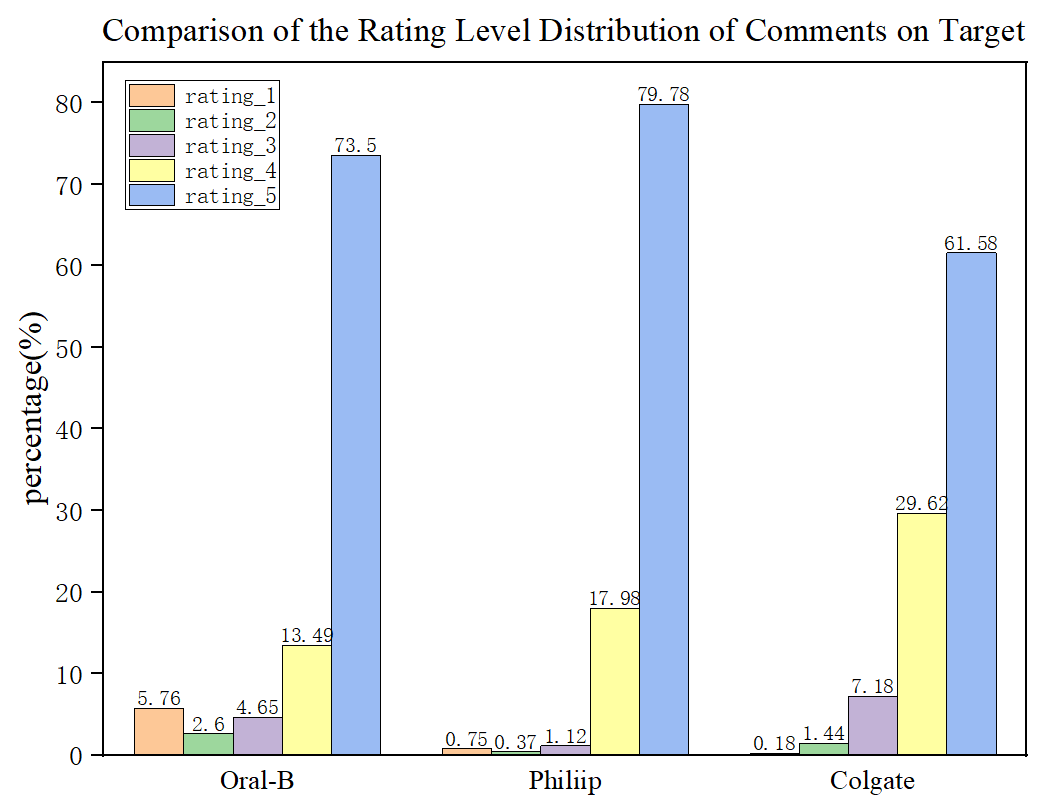
We got 3 beautiful pictures. The 3 products have the most rating-5 reviews, which shows the customers held a positive attitude towards their products. And on bestbuy.com, Philiip toothbrush even has zero rating-1 and rating-2 reviews.
3.Frequent Occuring Words in Reviews
Using the following code, by observing the most frequent words, we can observe which attributes of the product customers pay attention to.
for product in products:
    for platform in platforms:
        name = platform + '_' + product + '_Wordfreq'

        print('--'*50);
        print(f'Top 25 Frequent Words of Reviews of {product} on {platform}');
        print('--'*50)

        plt.figure(figsize=(20,8))
        plt.suptitle(f'Most Frequent Words_{product}_{platform}',fontsize =18)
        plt.xlabel('Frequent Words')
        plt.ylabel('Count of Occurence')
        plt.bar(Dict_Wordfreq[name]['token'][0:25], height = Dict_Wordfreq[name]['freq'][0:25] ,color = "#87CEFA")
        plt.grid(False)
        plt.xticks(rotation=45)
        if name == 'Target_Oralb_Wordfreq':
            plt.savefig("1.jpg")
        plt.show();
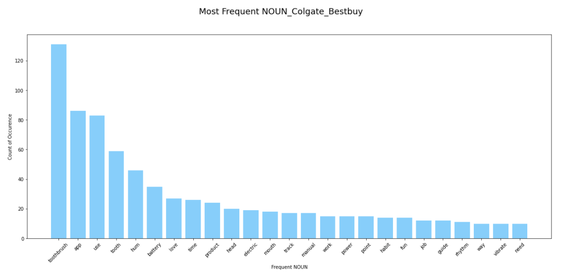
For example, we can conclude from the above picture, customers on Bestbuy platform, cared most ahout thr battery, charging time and the toothbrush head about Colgate toothbrush.