By Group "Four Guys"
Introducing a new parameter for stock prediction model
With the earning call transcript data that we have collected, we want to quantify this unstructured text data into new numerical data that we can use in our linear regression model to predict stock returns. While conventional models rely on structured data like P/E ratios, trading volume, and EPS, we hypothesize that the tone of management discussions may contain signals that can improve the prediction accuracy.

Our base model
We planned to use these traditional parameters to build our base model (Multilayer Perceptron):
- P/E ratio (to see if company is currently overvalued or undervalued)
- Average volatility (to account for stock’s volatility)
- Trading volume (to see liquidity indicator and market participation)
- EPS (previous earnings performance)
- Market returns (to account for overall market performance)
- Number of positive words and negative words (using the Loughran-McDonald Master Dictionary)
These parameters will be used to train the base model before adding in sentiment scores to ideally improve the model’s accuracy.
Generating sentiment score
One of the challenges we face is generating an accurate and useful sentiment score. There are several libraries that we researched before choosing the best one for our project.
VADER - this library is designed to analysis social media sentiments with the ability to better understand sarcasm and slang, but in our earning call transcript, most of the conversations for format with technical terms that VADER may not understand well
FinBERT- this library is fine-tuned and pre-trained with financial knowledge which is highly suited for our earning call data, however it is more computationally intensive than other models
def compute_vader_sentiment(text):
    """Compute VADER sentiment score."""
    if not text:
        return np.nan
    return vader_analyzer.polarity_scores(text)['compound']

def compute_finbert_sentiment(text):
    """Compute FinBERT sentiment score."""
    if not text:
        return np.nan
    try:
        # Truncate text to max length (512 tokens)
        inputs = finbert_tokenizer(text, return_tensors="pt", truncation=True, max_length=512, padding=True)
        with torch.no_grad():
            outputs = finbert_model(**inputs)
        logits = outputs.logits
        probabilities = torch.softmax(logits, dim=1).numpy()[0]
        # FinBERT labels: positive, negative, neutral
        sentiment_score = probabilities[0] - probabilities[1]  # Positive - Negative
        return sentiment_score
    except Exception as e:
        print(f"Error computing FinBERT sentiment: {e}")
        return np.nan

def compute_combined_sentiment(text):
    """Combine VADER and FinBERT sentiments (weighted average)."""
    vader_score = compute_vader_sentiment(text)
    finbert_score = compute_finbert_sentiment(text)
    if pd.isna(vader_score) or pd.isna(finbert_score):
        return np.nan
    # Weighted average (e.g., 50% VADER, 50% FinBERT)
    return 0.5 * vader_score + 0.5 * finbert_score
Our code calculates a combined sentiment score by averaging results from both VADER and FinBERT to leverage their complementary strengths:
-
VADER (fast, slang/sarcasm-aware) provides a baseline sentiment score.
-
FinBERT (financial-domain specialized) adds nuanced understanding of financial jargon.
The final score (compute_combined_sentiment) is a 50/50 weighted average of both, balancing speed and domain relevance while handling edge cases (empty text, errors) gracefully.
Visualization
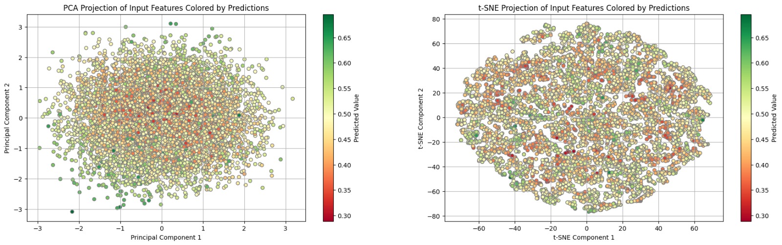
One of the challenges we face when using deep learning models is the visualization problem. We train our model with seven inputs from the previous week: weekly return, PE ratio, EPS ratio, bid volume, ask volume, volatility, and, most importantly, sentiment scores from earnings calls. The model's output is the predicted weekly return for the week following the publication of the earnings call transcript. However, visualizing the relationship between these seven inputs and the target variable (the upcoming weekly return) is difficult, as it cannot be easily represented in 2D or even 3D graphs.
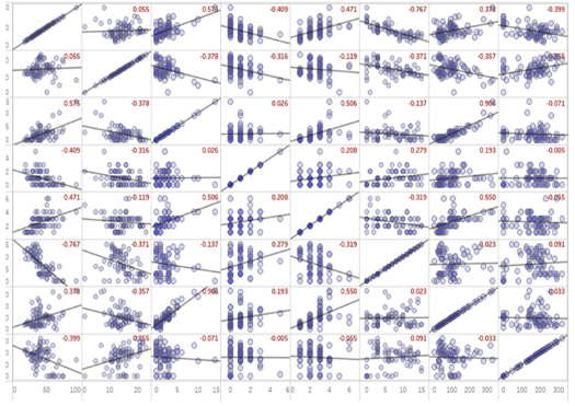
We therefore attempted an 8 by 8 pairwise plot, but it's challenging to gain clear insights due to the numerous variables involved. Additionally, these variables may interact with each other, further complicating their collective influence on the output.
Ultimately, we chose to use Principal Component Analysis to reduce the dimensionality from 7 to 2. We also color-coded the output variables to enhance the visualization of our model's predictions.